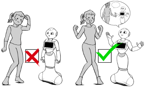
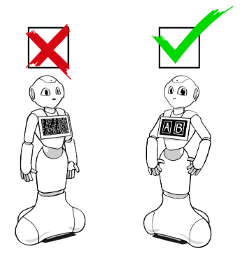
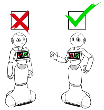
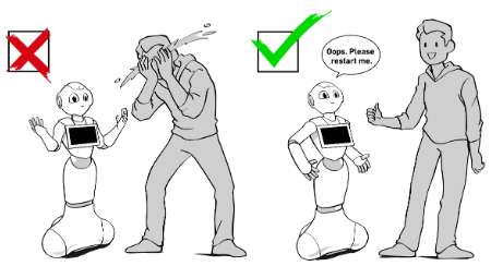
To create a positive experience with Pepper, provide three pieces of precise information to users:
Take care of your users by creating accessible and predictable applications, by preventing them from making mistakes, and by helping them if they’re in trouble in the user flow.

WHY?
Before every expected user action, guide users by indicating what to do and how to do it. Leave no room for guessing.
HOW?
Use at least two of these three options to express a sign:
EXAMPLE
WHY?
Give feedback to the user right after their action so they know if the action was successful or not.
HOW?
Use at least two of these three options to express feedback:
EXAMPLE
WHY?
Fallbacks help users return to a more comfortable flow of interaction. They avoid failed interactions and ones that come to a dead end.
HOW?
Attach a timer to every expected user action. After a few seconds without user action, Pepper should repeat the demand. After one or two fallbacks, Pepper should offer to help or quit the application.
EXAMPLE
If the user doesn’t answer a question, repeat the question once or twice, then ask if someone is still there. If there’s no reply, Pepper should close the application.
WHY?
When users don’t understand or fail at following the flow, it’s often because of a missing sign, missing feedback, or a missing fallback.
HOW?
To identify any missing signs, feedback, or fallbacks in the application, test it with target users at different steps: proof of concept, in development, and after release. Use a cross- section of people unfamiliar with the project from different ages and genders.
EXAMPLE
For a usability test, eight users are needed to detect 90% of the usability issues.

WHY?
Remember, users interact with Pepper by standing in the interaction zone – within one meter/three feet of Pepper – which is not the same way most tablets are used.
HOW?
EXAMPLE
WHY?
We’re not all the same height. Adults have to lean down to click on Pepper’s tablet. Kids have to stand on their tiptoes.
HOW?
For a children’s application, it’s better to place the buttons on the bottom section of the tablet.
EXAMPLE
On a menu with many applications, place the most attractive content for kids at the bottom of the tablet.

WHY?
Graphic and sound signals are used on a daily basis and are common to all cultures. These are called standards. Implementing these standards helps users become familiar with a new product and increases their confidence.
HOW?
Pay attention to keep and not conflict with cultural standard formats, colors, and icons in your application.
EXAMPLE
For example, EU and U.S. color standards:
Thanks to these color codes, children are able to interact with Pepper without needing to read.
WHY?
Predictability of actions is an important part of learning the process. Random responses make it hard to control Pepper.
HOW?
Associate one single icon to one feature and do not change it throughout the application. Associate one single trigger word to one behavior and do not change it throughout the application. Only use random content for Pepper’s verbal answers to add variations to its speech but not for features.
EXAMPLE
Every time the user presses the torso button for three seconds it will turn Pepper on or off. It’s not a random behavior; it always has the same result.

WHY?
All important actions must be validated by users to protect them from incorrect vocal recognition or miss-clicking, which could heavily compromise their experience with Pepper.
HOW?
Ask users by voice before executing the user action, and also display the same warning on the tablet to let them pick which way they want to respond.
EXAMPLE
When Pepper understands a tablet touch or voice trigger request to exit the application, Pepper has to ask for user validation to be sure it’s not a user mistake or a miss-click.
WHY?
Be careful about the formulation of Pepper’s questions in order to anticipate the answers.
HOW?
Pay attention to the question formulation to know if Pepper expects a “Yes/No” answer or a key word answer. To get a “Key Word” answer, use the key word in the question. It informs users about possible answers. Ask only one question per output.
EXAMPLE
Don’t: “I can show you a dance or we can play a card game together. Everything is okay for me. So, what do you want?”
Do: “Do you want to see a dance or to play a game?”
WHY?
Formulating closed-ended questions is more efficient than open-ended questions. It’s impossible to predict what users can answer with open-ended questions.
HOW?
The best way to do this is to list the choices users can select as an answer.
EXAMPLE
Don’t:
“What can I do for you?” because the robot is not able to understand the millions of possible answers.
Do:
“Do you want to play a game with me?”
WHY?
A rhetorical question is a question that is asked to make a point rather than to elicit an answer. Though a rhetorical question does not require a direct answer, in many cases users answered and the interaction failed because Pepper was (and still is) not able to manage many answers.
HOW?
The rule is simple: A question must always:
EXAMPLE
Don’t: “Wasn’t that funny? I have another joke.” because the user could answer the question, but Pepper doesn’t expect an answer.
Do: “That was so funny. I have another joke.”
WHY?
To teach something complex to users, split the flow into a chain of simple actions. It will make the task easier and it will guide time through the whole process.
HOW?
Ask for only one user action per step and clearly express to the users what they have to do at each step. Make it simple and efficient by only giving useful information at the right moment. Don’t display every option at the same time, only relevant information in a smart, step-by-step flow.
EXAMPLE
In a game tutorial, don’t give users all the controls and large amounts of information at the same time. Make it easy for them to learn the game by giving information step-by-step with some practice trials. Or give new controls at different steps of the game, when it’s relevant.
WHY?
To protect users from mistakes, it’s important to make dangerous features somewhat difficult to get to.
HOW?
EXAMPLE

¶WHY?
Some user actions are critical or frequent enough to merit additional guidance from Pepper.
HOW?
Think through the interaction and consider what challenges a user might encounter in a given context. Consider, specifically, what information they might require to succeed. Then write helpful and suitable answers.
EXAMPLE
For example, in a game if the users must place their hands on Pepper’s to start:
Don’t:
User: “Help”
Pepper: “…”
User: “I don’t understand.”
Pepper: “Ok. Let’s begin.”
Do:
User: “Help.”
Pepper: “Place your hands on mine to start!”
WHY?
Don’t lead users to a dead end.
HOW?
Give all the instructions in an error notification to explain the issue and give users the solution to fix it.
EXAMPLE
When Pepper asks for a user’s phone number and the format doesn’t match with the expected data, Pepper has to first warn, then ask them to double-check the number they entered.
¶WHY?
Users will sometimes stray from the main flow, trying to test Pepper’s limits, or asking for other content. Be prepared to field such requests and redirect the user gently back to the main content.
HOW?
Always take into consideration that users can try to stray from the main flow!
If the robot is not able to manage a requested action, Pepper should acknowledge the question, but deflect it politely by proposing a path back to available content. Design such responses to prevent the user from getting lost in the interaction.
EXAMPLE
If a user tries to ask Pepper: “Can you play guitar?”
WHY?
When Pepper is having trouble understanding a verbal conversation, develop a “not understood” strategy to help users.
HOW? Make sure, to have an “e:Dialog/NotUnderstood” for all questions in the dialogue. When a “not understood” event happens, make Pepper repeat the question. If Pepper still doesn’t understand, don’t loop. Use an “e:Dialog/NotUnderstood2” to ask the user to make a choice on the tablet.
EXAMPLE
For example, if Pepper says, “Do you want to play a game or to see me dancing?”
User: “blah blah blah”
Pepper: “I didn’t understand. Can you repeat that please?”
User: “blah blah blah”
Pepper: “I’m sorry I cannot hear you very well. Please make a choice on my tablet.”
WHY?
Users can make mistakes, and a smart system has to allow users to cancel or edit the filled data.
HOW?
After a user makes a choice, handle the risk of mistakes with a BACK, CANCEL, DELETE, or EDIT button, depending on the situation.
EXAMPLE
Add a BACK or HOME button to allow a user who picked a category in a menu to go back to this menu if they change their mind.
 Anticipate pain points, and offer assistance accordingly.
 Always guide the user back to the main flow gracefully.